


Most people choose website images the same way they make decisions when they’re already overwhelmed: one at a time, based on whatever feels least wrong in the moment.
A photo works for a section, so it goes in. Another looks professional enough, so it gets saved. On their own, those images are usually fine – sometimes they’re even good.
Over time, though, the site starts to feel scattered, like each section is doing its own thing instead of supporting the whole.
When that happens, the instinct is almost always to search for better images or a different aesthetic altogether.
But what’s missing isn’t quality.
It’s a way to decide which images belong together – and which ones don’t.
And without anything guiding the choices, the site becomes harder to stay with. You scroll, but nothing quite settles, and the work underneath – the care, the thinking, the nuance – doesn’t come through as clearly as it should.
What Intentional Images Are Actually Doing
When images are chosen with intention, they’re not just filling space on the page.
They’re supporting the experience.
You can usually sense this before you can name it. The site feels calmer. More cohesive. Like it knows what it’s doing, even if you can’t quite explain why.
That confidence doesn’t come from one standout photo. It comes from a collection of images that relate to one another – similar light, similar tone, a familiar visual temperature that carries through the page. Your eye doesn’t have to keep recalibrating. It knows where it is.
Those images help reinforce the story without spelling everything out. Instead of showing everything, the photos give just enough context – a sense of presence, process, or outcome – to support the copy rather than competing for attention.
When images are working together this way, the experience of being on the site gets easier.
Your attention isn’t pulled in five directions. The page doesn’t ask you to keep reinterpreting what you’re seeing. It simply holds you.
That ease is what people often describe as a site feeling “calm” or “confident.” Not because the design is better or more complex, but because it’s clearer.
The Shift That Actually Changes Things
Most people try to fix a visually busy site by adding more.
More images. More options. More variety – as if the right photo is still out there somewhere, waiting to solve the problem.
But clarity rarely comes from accumulation. It comes from deciding what doesn’t belong.
Curation isn’t about having fewer images for the sake of restraint. It’s about choosing with intention instead of habit. About knowing, ahead of time, what kinds of images support your brand – and which ones pull it off course.
When that shift happens, choosing images stops feeling reactive. You’re no longer deciding in the moment, based on what looks fine or feels urgent.
You’re filtering.
Not rigidly. Not permanently. Just clearly enough that each new choice has a reference point – and the site can begin to settle into itself.
A Way to Re-Orient Your Eye
If you want a place to start that doesn’t turn into another project, start by changing the question you’re asking.
Instead of deciding whether you like an image, try noticing what it’s actually doing for the page.
Some images set tone – they establish a mood that carries through the site.
Some help someone understand how you work, or what it feels like to engage with you.
And some, even when they’re technically good, don’t add clarity at all.
When you pause and notice that difference, a few orienting questions naturally follow:
– What role is this image playing here?
– Would it feel natural sitting next to the other images on the page?
– If I removed it, would the page lose clarity – or gain it?
You don’t need perfect answers. You’re not building a system yet.
You’re just giving yourself a clearer lens – one that makes the next choice feel a little less loaded.
Building Coherence Without Locking Yourself In
Rather than trying to curate your entire image library at once, it helps to work within a smaller container. Not a full framework – just a short list of image types your brand tends to rely on most.
For many businesses, those images naturally fall into a few familiar roles:
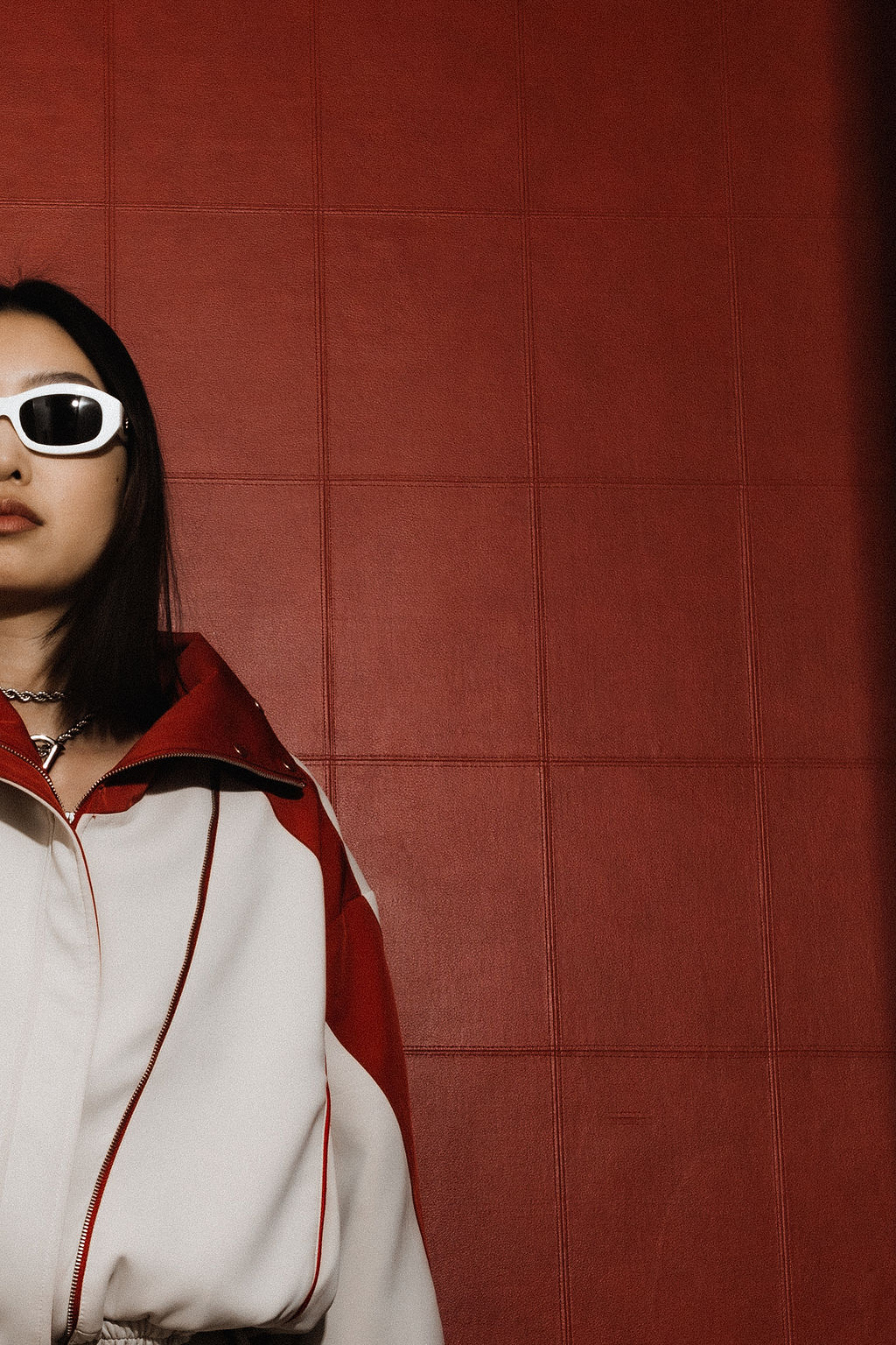
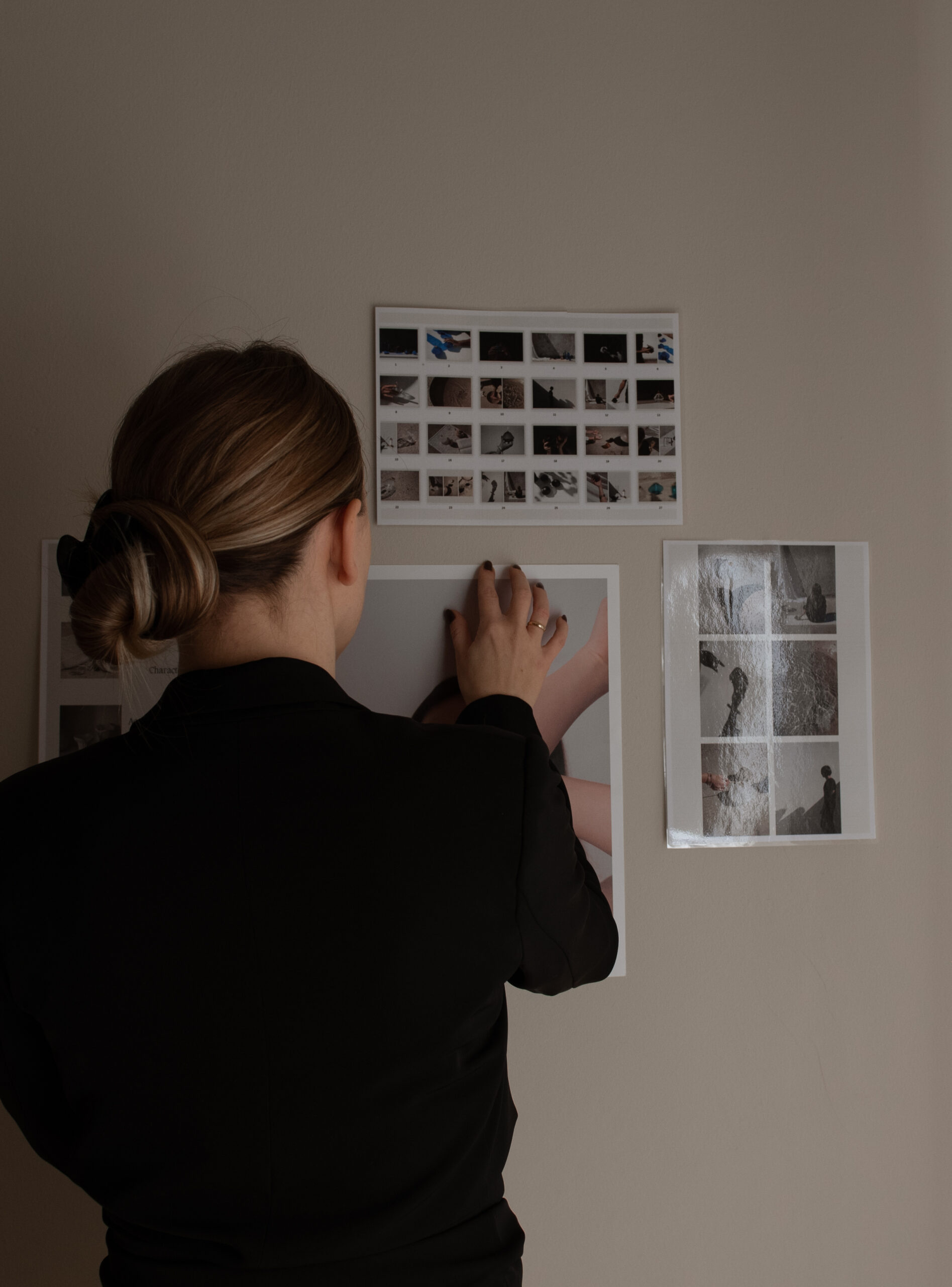
Images that show presence – you, people, moments of focus or interaction.
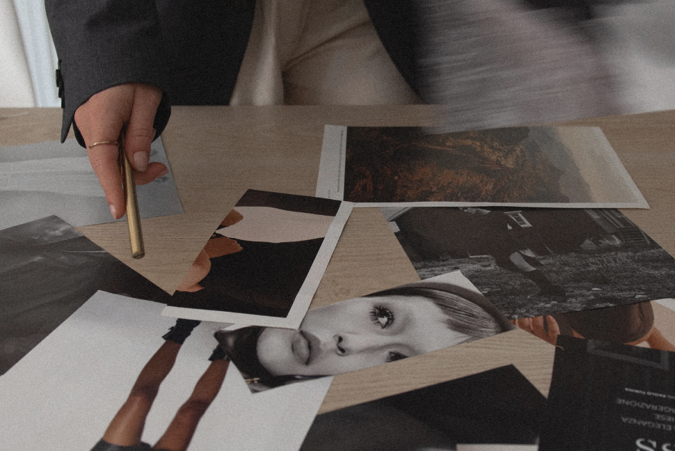
Images that suggest process – work in progress, tools, learning, making.
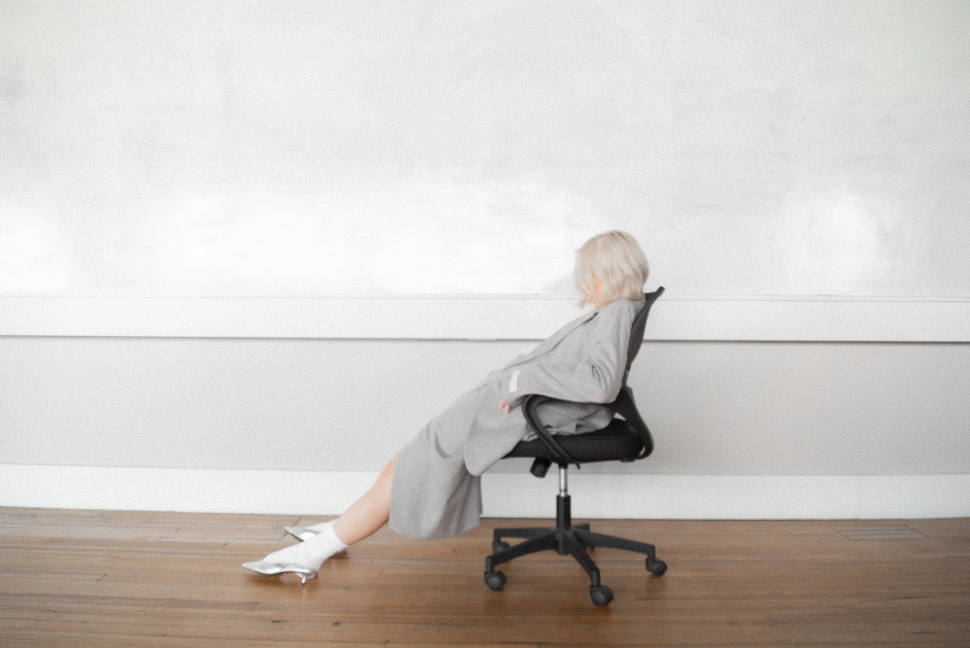
Images that imply outcome – ease, confidence, clarity, relief.
These aren’t rules, and they don’t need to be literal. They’re simply a way to give your choices context.
When you know the role an image is playing, it’s easier to tell whether it supports what the page is trying to do – or whether it’s only there because it was available.
The goal isn’t sameness or strict consistency.
It’s familiarity.
Enough coherence that the images feel like they’re part of the same conversation, even when they’re doing different kinds of work.
Think about different rooms in the same house. The kitchen and the bedroom don’t look identical, and they’re not meant to. But you can tell they belong to the same space. The materials relate. The tone is consistent. Nothing feels out of place.
Your website works the same way.
You probably don’t need better images.
You may not need a bigger library, a new photoshoot, or a full visual reset. Most people don’t.
What usually makes the difference is having a clearer sense of what you’re actually looking for when you choose an image – and what you’re no longer willing to choose by default.
Once that shift happens, something subtle changes. You hesitate less. Editing gets easier. The site starts to feel like it’s speaking with one voice instead of several competing ones.
This isn’t about locking yourself into a rigid visual identity.
It’s about giving your taste a little more authority – enough structure that your choices start supporting one another instead of asking to be re-decided every time.
If your website images have been bothering you in a way you couldn’t quite name, it’s usually not because something is broken. It’s because your eye has gotten more discerning, and your site hasn’t caught up yet.
That’s not a problem to rush past.
It’s a signal worth paying attention to.


Read the Comments +