


If you’ve read Why Good Website Images Still Feel Disconnected, you know this part already: even beautiful images can feel wrong when they aren’t aligned with what your brand is actually saying.
Your sense of what you’re saying – and who you’re saying it to – is sharper. You can feel when an image pulls away from that meaning, even if it’s a beautiful photo.
So the question isn’t why images feel off.
It’s how to choose images that actually support the story your site is telling – without defaulting to stock shorthand, surface-level symbolism, or another round of visual second-guessing.
This is the point where clarity stops being abstract and starts shaping decisions. Where you’re no longer collecting images, but selecting them. Not to decorate the site, but to extend the brand work already happening in the background.
What You’re Choosing For
Before images can work together, they need something to work toward.
Image selection doesn’t start with visuals. It starts with branding – specifically, with your brand message. The point of view you’re advancing. The change your work creates. What you want someone to understand about you after spending time on your site.
You don’t need a polished tagline or a perfectly articulated manifesto here – just clarity at the level of meaning. You need to be able to name, in plain language, what you’re here to say.
It’s probably a sentence you’ve already said out loud. One that feels true even if it isn’t clever. That message becomes the reference point in the background while you choose images.
Because images are never neutral. They either reinforce that message or dilute it.
If an image doesn’t help carry your brand message forward, it doesn’t belong. Even if it’s beautiful, or on trend, and even if it feels like it should work.
And if your message still feels slippery – if you know you have something real but haven’t quite pinned it down yet – that’s not an image problem. It’s a clarity gap. One worth closing before you ask visuals to do that work for you.
(This is exactly the kind of grounding my free Mini Brand RX is designed to support. Grab it here if you want some guidance working with this.)
Once you’re clear about what you’re building, image selection stops being a visual scavenger hunt.
It becomes an editorial decision.
What Makes an Image “Work”
An image works when it does more than fill space or break up text. It works when it reinforces something already true about your brand – your tone, your message, your positioning.
That doesn’t mean it has to be literal. You’re not looking for a photo of someone doing exactly what your service provides. But you are looking for an image that feels consistent with the world you’re building.
If your brand positioning is grounded and warm, an image that feels sterile or overly styled will create friction – even if it’s objectively gorgeous.
If your tone is editorial and modern, an image that skews trendy or overly saturated will feel mismatched.
If your message is about simplicity and clarity, an image with too much visual noise will compete instead of support.
The image doesn’t have to say what you say. But it does need to feel like it came from the same place.
A Practical Filter for Real Decisions
When you’re evaluating an image – whether you’re scrolling a stock library or reviewing your existing site – the question isn’t “Do I like this?”
It’s closer to: Does this belong here?
A few orienting questions help clarify that distinction:
Does this image match my brand’s emotional tone?
Not the mood you wish your brand had. The one it actually has. Calm brands feel unsettled by chaotic imagery. Warm brands feel distant when images skew cold or detached.
Does the styling align with my visual language?
Look at color, props, lighting, composition. Do they reflect the same sensibility as the rest of your site? Modern and minimal brands feel off when images become ornate or busy.
Does this feel current without trying too hard?
Trendy styling dates quickly. Images with thoughtful composition and restrained choices tend to hold their ground longer than whatever aesthetic is peaking this season.
Is the energy level right?
Some images feel dynamic. Others feel still. Neither is better – but one will align with your brand more naturally. A steady, assured brand rarely benefits from frenetic visuals.
Does this image add context, or just decoration?
The strongest images orient the reader. They create a sense of place, mood, or meaning. If you could remove the image and nothing would feel different, it isn’t doing its job.
Could this image live anywhere, or does it belong here?
Generic images feel interchangeable because they are. Specificity – in subject, composition, or tone – is what makes an image feel intentional rather than filler.
This isn’t a rigid system. It’s a set of questions that help you move from “I like this” to “This works here.”
You’re not judging whether an image is “good.” You’re deciding whether it fits.
That distinction is where authority begins.
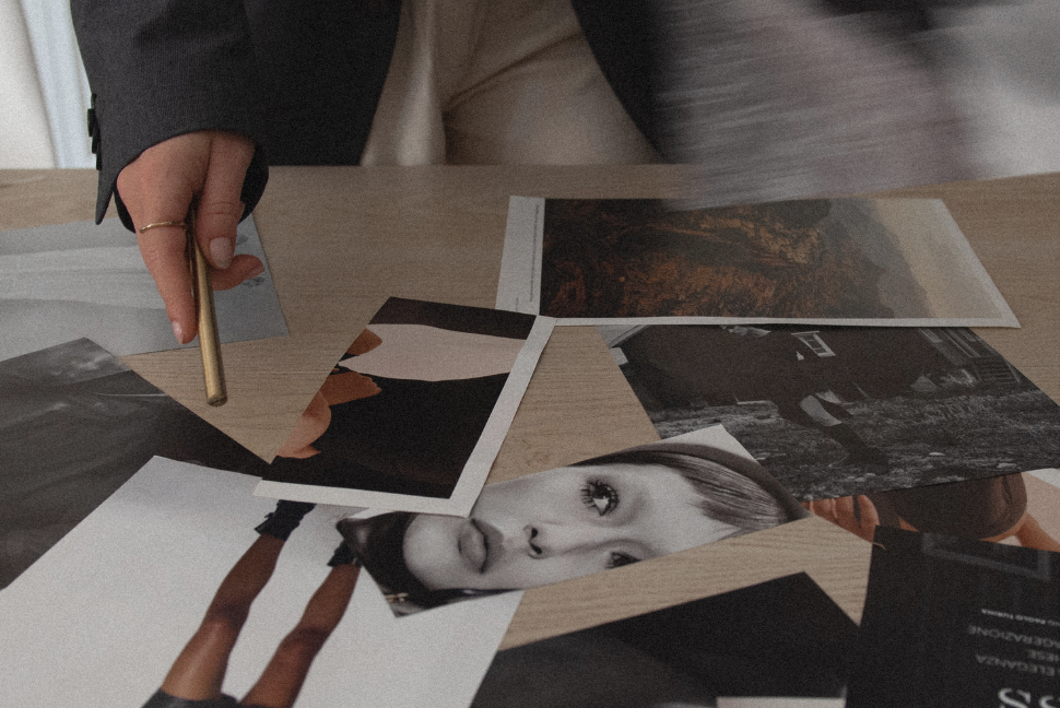
The Folder Test: Seeing Cohesion at Scale
Here’s something I learned from designer Jeff Shipley that changed how I think about image selection entirely:
Put all your website images in one folder and look at them together.
Not on the page. Not in context. Just the images, side by side, all at once.
This sounds almost too simple to matter. But it works because it removes the narrative logic of your website and forces you to see the images as a visual collection.
Patterns show up immediately.
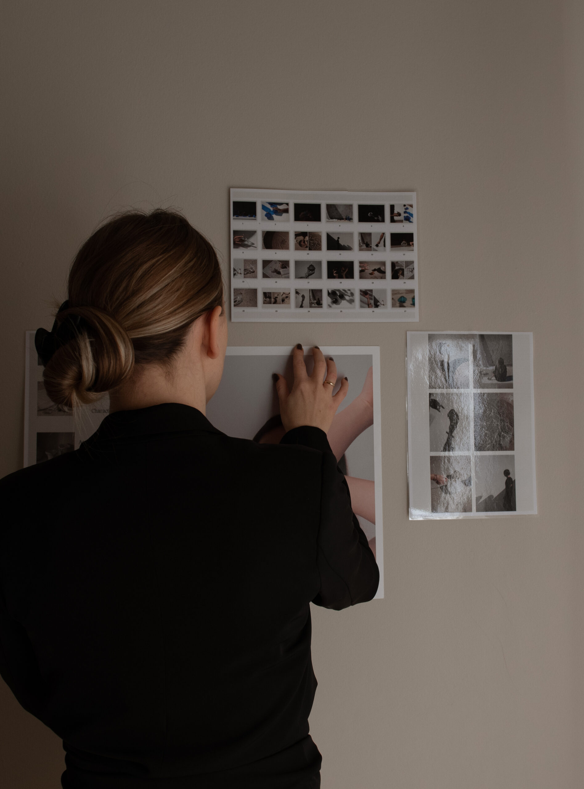
You notice if one or two images don’t belong – whether it’s the color palette, the styling, the mood, or the composition. They jump out. Not because they’re bad, but because they’re not part of the same visual family.
You also see gaps or repetition you might miss otherwise. Too many close-ups and not enough environmental shots. Too many images of laptops or artfully placed cups of coffee. Too many images that feel somber when your brand promises ease and clarity.
The folder test doesn’t replace individual image evaluation. But it catches the things individual evaluation misses: cohesion, balance, and whether your images are actually working together across the site.
If an image feels out of place in the folder, it’s going to feel out of place on the page – even if you can’t put your finger on why.
Where to Source Images That Don’t Look Like Everyone Else’s
Finding elevated images that actually align with your brand doesn’t require an unlimited budget. But it does require knowing where to look – and what each resource is actually good for.
One note before we go further: I’m an affiliate for some of the resources below, marked where relevant. I recommend them because I personally use them and have seen them work well for clients – and I’m always happy to pass on a discount for something that’s worth it.
Free Resources
Kaboompics
Kaboompics is a free stock library created by a single photographer with a clear and consistent style. The images skew modern, warm, and editorial – which means even when they’re from different collections, they tend to work well together as long as you’re staying within similar color tones.
One of its most useful features is the ability to view entire shoots. That makes it easier to select a small set of images that share lighting, tone, and composition.
The tradeoff: because it’s free, many people use the same images. You’ll want to be selective so your site still feels distinct.
Pexels & Unsplash
Pexels and Unsplash are both massive free stock libraries with a wide range of styles and subjects. The sheer volume means you can usually find something – but it also means the quality and aesthetic are inconsistent.
The strength here is breadth and accessibility. If you need a specific subject or scene and you’re working within a tight budget, either one of these often has options.
The limitation: because these sites pull from so many contributors, images don’t naturally work together. You’ll need to apply stricter filtering on your end – color palette, composition style, mood – to create cohesion across what you select.
Paid Resources
The Vault
The Vault offers styled stock imagery that skews feminine, editorial, and aspirational without feeling overly trendy. The photography is high-quality, and the library is organized by aesthetic and subject, which makes it easier to find images that work together.
This is a good fit if your brand is polished, warm, and modern. It’s less suitable if your aesthetic skews minimal, traditionally classic, or more masculine in tone.
Haute Stock (Affiliate)
Haute Stock provides curated styled stock photos with a strong emphasis on cohesive color palettes and brand-friendly composition. The library is organized into collections, so once you find a style that works, you can pull multiple images from the same shoot or aesthetic family.
The images tend to feel elevated but approachable – not overly aspirational, not too casual. This works well for brands that want polish without feeling pretentious.
The membership model gives you access to the full library, which is useful if you’re building or refreshing a site and need multiple images at once.
Élevae
Élevae focuses on inclusive, contemporary imagery with diverse representation and modern styling. The aesthetic is clean, confident, and editorial without feeling cold.
This is one of the stronger options if you want images that feel current but not trendy, and if representation and inclusivity matter to your brand positioning.
The library is large and the curation is strong – so what’s there tends to be high-quality and usable.
Editorial Stock Images (Affiliate)
Editorial Stock Images offers a more refined, magazine-style aesthetic. The photography is restrained, compositionally strong, and often more conceptual than literal.
This is the right fit if your brand skews sophisticated, modern, and design-forward. It’s less suitable if you need warmth, approachability, or more relatable lifestyle imagery.
The library is smaller and more selective, which means fewer options – but higher consistency in style and quality.
Using Stock Without Giving It Control
Stock platforms are tools, not editors.
They’re designed to show what’s popular, abundant, or visually striking – not what best supports your brand message. That judgment still belongs to you.
Staying in authority means choosing fewer images, not more. It means trusting restraint and letting coherence matter more than novelty.
You don’t need to show everything. You don’t need to prove range. You don’t need to justify why you didn’t use an image that technically works.
When images are aligned with branding, the site feels composed. Confident. Intentional.
Not because every image is perfect – but because every image belongs.
Selection, Not Guesswork
Choosing images that work isn’t about finding a formula or following a set of rigid rules. It’s about building a reference point – knowing what your brand feels like, sounds like, and looks like – and using that as a filter.
When that clarity is there, image selection stops feeling overwhelming. You’re not evaluating every option against an abstract sense of “good.”
You’re asking whether it fits what you’re building.
The images don’t have to be perfect. They don’t have to be custom. They just have to feel like they belong.
And when they do, your site stops feeling like a collection of pages and starts feeling like a cohesive whole – one that reflects the brand clarity you’re continuing to deepen and expand.


Read the Comments +